Official Mongoose Traveller 2nd Edition Character Sheet On Roll20 Is Live!

Just wanted to tell you (again) that you did excellent work here. Last year I made a couple of suggestions and you immediately implemented those. You rock!
Thank you for your kind words Stringray_tm, I am fortunate that being retired I can spend lots of time on my hobbies ;-)
Next release should be in a few days and compendium work is proceeding apace,
Regards,
~ Coryphon ~
 
Hi All,

The latest release of the character sheet is live with the following changes:

v1.0.06
- Removed italics from skill mods for clarity
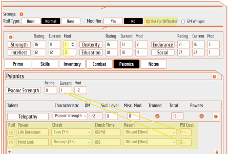
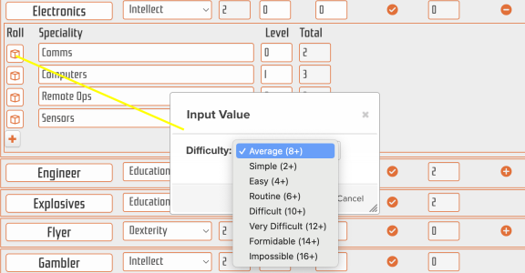
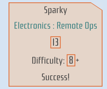
- Added 'Ask for Difficulty' checkbox which will show a difficulty dropdown and calculate success/failure for characteristic/skill rolls
- Changed Psionics powers to reflect the rules with reach, difficulty, check time etc. This also calculates success/failure and displays in roll
- Added custom psionics repeating row
- Fixed animal darkmode combat rolls
- Minor formatting fixes

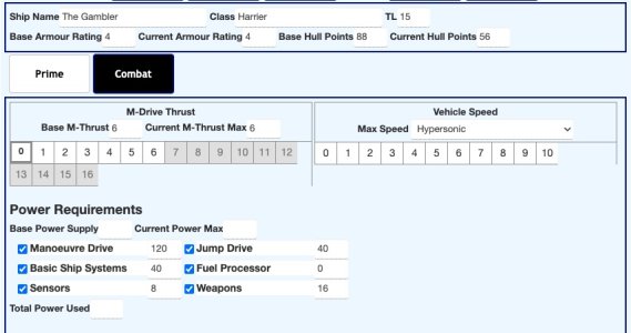
Screenshot showing 'Ask for Difficulty' toggle, no italics on Mod values and upgraded Psionic Powers:

TravellerCS-v1.0.06-1.png

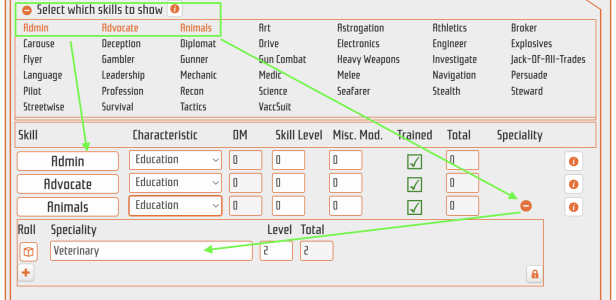
When 'Ask for Difficulty' is set:

TravellerCS-v1.0.06-2.png

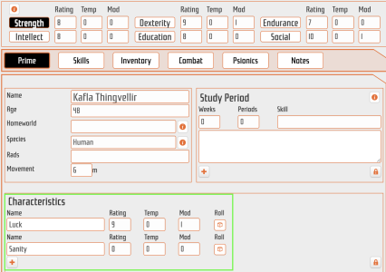
Defaults to Average difficulty, and when clicked the roll template shows values plus success/failure:

TravellerCS-v1.0.06-3.png

Best regards,

~ Coryphon ~
 
Super work @Coryphon ! I used the character sheet on Sunday for a one-shot game, and found the style really amenable to the gameplay.

Only thing that wasn't standing out for me was the Prime/Skills/Inventory/... ribbon. Maybe give these menu items a nice orange background, instead of the same white backgrounds that are used on the data fields? Some more contrast would have been helpful, anyway :)
Thank you for the feedback Limpin.

Will look into making those contrast changes 👍

~ C ~
 
I have just switched to the new sheets for both my games. Yet to get player feedback, but my initial observations are that this is a great improvement. Love the implementation of Jack-of-all-Trades, and the addition of difficulty levels. One criticism is that the reversion of the Trained tick/cross icons to a single colour is a backwards step in my view. I much preferred the green/red coloured icon that make it easier to spot what skills you are trained in.
 
I have just switched to the new sheets for both my games. Yet to get player feedback, but my initial observations are that this is a great improvement. Love the implementation of Jack-of-all-Trades, and the addition of difficulty levels. One criticism is that the reversion of the Trained tick/cross icons to a single colour is a backwards step in my view. I much preferred the green/red coloured icon that make it easier to spot what skills you are trained in.
Hi Gavain,
Thank you very much for the feedback. I will look into the colours for the trained tickbox,
~ C ~
 
Back
Top