Jujitsudave
Mongoose
Including full frontal errata will be necessary to get my attention.
HA HA HA HA!! I like people with a good sense of humor!

Including full frontal errata will be necessary to get my attention.
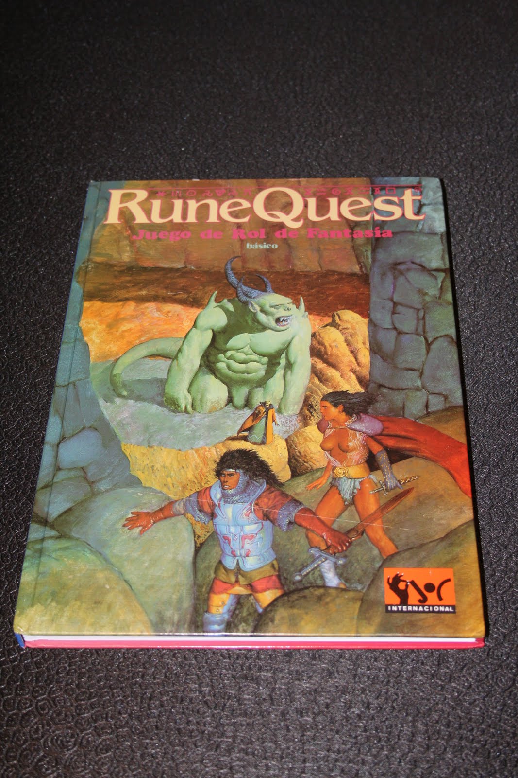
A sizeable market segment, I think you'll agree. :wink:torus said:[...] the cartoon artwork and cleavage seems to be appealing primarily to masturbating adolescents.
But a good move if the target audience is indeed new (and thus younger) players rather than we old curmudgeons. Character art has to appeal to the target age group. Leaving aside questions of quality, teenagers are not going to want to imagine themselves as grizzled, middle-aged warhorses.torus said:In fact the individuals pictured look like teenagers themselves to me, whch makes it doubly dodgy.

Vile said:A sizeable market segment, I think you'll agree. :wink:torus said:[...] the cartoon artwork and cleavage seems to be appealing primarily to masturbating adolescents.
But a good move if the target audience is indeed new (and thus younger) players rather than we old curmudgeons. Character art has to appeal to the target age group. Leaving aside questions of quality, teenagers are not going to want to imagine themselves as grizzled, middle-aged warhorses.
As far as I remember.

torus said:But this cover is terrible. Leave aside the fact that it's unattractive and uninspiring; the cartoon artwork and cleavage seems to be appealing primarily to masturbating adolescents. In fact the individuals pictured look like teenagers themselves to me, whch makes it doubly dodgy.
Although this particular piece is not necessarily appropriate for MRQII (i.e. the Greek hoplite), I think the tone is perfect, and it is evocative of earlier RQ art.
Too true!Jujitsudave said:If the 3 n00bs on the cover ended up in THAT battle, 2 of them would be separated from their vital organs while the big boobie one would end up being the hoplite's slave.
Jujitsudave said:That is EXACTLY (yes, even the time period BECAUSE it is evocative of early RQ art) that embodies the system. That is a far better cover. Mongoose may want to get the rights to that.
")
BiggerBoat said:It's also just a kick-ass scene that makes you want to roll some dice to see how it all turns out

msprange said:All ladies have boobies, they are nothing to be scared of.
For various reasons, we like the cover of the rulebook a great deal, and we will be keeping it.
However, that doesn't mean we can't offer an alternative for those who don't like it. What about something like this;
Image
For my part, something really simple and elegant like that would be great. But the logo should be consistent across editions (and really, whether or not I'm in the minority, I liked the logo anyway).