Poll : New logo for A Call To Arms

Do you prefer the new logo or the old one?

  • Old one

    Votes: 0 0.0%
  • New one

    Votes: 0 0.0%
  • Don't mind

    Votes: 0 0.0%
  • Actually I have my own design I'd like you to take a look at . . .

    Votes: 0 0.0%

  • Total voters
    0
The logo painted on the WS is the same BTW as the shield on the uniform maws: a golden 5 tih a silver sword pointing upwards towards it, and 6 golden stars (3 each side), on a diagonal blue / white field, bordered by red.
 
Wulf Corbett said:
oreso said:
Babylon 5 should appear on the logo somewhere of course, but A Call to Arms should be at least noticeable.
Mongoose are making money out of the setting far, far more than from the system. It also costs them more to license. Therefore, the Babylon 5 logo should be prominent.
I guess, its a shame though. Fans should recognise "A Call to Arms" anway, so its not as if it detracts to have it more readable.
 
oreso said:
Wulf Corbett said:
I guess, its a shame though. Fans should recognise "A Call to Arms" anway, so its not as if it detracts to have it more readable.

Fans probably would but non fans are more likely to recognise "Babylon 5".

Remember that the game was originally called "A Sky Full Of Stars" I ran a poll back then to see which name was preferred.

http://www.mongoosepublishing.com/phpBB2/viewtopic.php?t=2508&highlight=poll

Results:

Sky Full Of Stars 41% [ 15 ]
A Call To Arms 33% [ 12 ]
I don't really care, I just want to play it. 25% [ 9 ]

Total Votes : 36

So ACTA might have been SFOS, so what would SFOS have been called? ACTA?

LBH
 
The new logo is not bad, reminds me a bit of the Rangers badge.

I would agree with the some of the others here - the ACTA needs to be lot more prominent!

DW
 
I kind of like the old one. The new one looks nicer in general but the old one looks more appropriate for Babylon 5.
 
i definately prefer the old one, the new one is a bit hashed looking.

the new one reminds me of fruit flavoured polo mints for some reason, wierd. :?
 
Rohirrim said:
The Darque One said:
i like the new one, just not the colours of the 5, i don't think the red and blue go together.. i don't think the old one looked anymore B5ish. i don't think we ever saw that colour scheme in the series.

Season 4 "No Surrender, No Retreat" when the White Stars are preparing to depart for Proxima Lt. Corwin says "I just noticed the new paint scheme on the WS2" which then pans out to show the B5 symbol painted on. It's black and yellow with a sword pointing downwards. It is also in the intro to season 5.

i know what was painted on whitestar 2's wing. it was the babylon 5 shield. the only thing the old logo had in common with it is that the old log had a five that had a bit of gold on it.

if you don't think Babylon 5 should be the most prominent thing on it then niether does A Call to Arms since that was just named after a telemovie and really has nothing to do with the mechanics. could have easily been called Babylon 5: Grey 17 is Missing. people will not pick it up in a game shop with no idea of what it is becasue it says A Call to Arms on it. but Babylon 5 will certainly catch the eye of a fan. even people who like space combat probably wouldn't be atracted to A Call to Arms because it sounds more like historical recontructions with soldiers on horseback and flintlock rifles.
 
lol. for the record, i never said we should get rid of 'Babylon 5', ONLY that we should make 'A Call to Arms' more noticeable, since that is the name of the game and at the moment its a bit unreadable (at least at my resolution).

Heres an entirely uncontrived situation:
At a gaming group near you:
"Lets meet up and play B5 tonight?" says the group leader.
"Sure!" the gaming group reply.
Later that evening, some turn up with FA ships, some with RPG playsheets, two die hards with GROPOS, and one confused guy with some action figures and the leader wanted to play ACTA!
The leader sighs and says "If only I had noticed what the game was called, but the logo was unreadable!".

:p

if you don't think Babylon 5 should be the most prominent thing on it then niether does A Call to Arms since that was just named after a telemovie and really has nothing to do with the mechanics.
I shall bite back my initial sarcasm. :) Im not trying to de-B5 the game, only distinguish it with a (readable) name of its own. Sheesh!

Cheers!

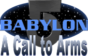
EDIT: something like this, nice and clear:
b5ACTAlogo.gif

pheer my l337 ph0t0sh0p ski11z!!!11
Seriously, probably should have a ship (whitestar?) coming out of the starfield or some such or perhaps replace the star field with a hyperspace portal. Needs a contrasting colour in there too, probably gold/yellow.
 
i can't hear it when people speak leet. but i agree that the A CAll to Arms should be more prominent. but not more prominent the that Babylon 5 part.

A Call to Arms was prominent just fine on the old one. the new one is more stylised. maybe a mix of the 2.

i seriously think thats the group leaders fault for not being clear though. that scenario only really works with this game coz of all the diferent games bearing the Babylon 5 name.
 
Hmm, well the new logo makes it clear that this is not just an off-shoot of the B5 rpg (also produced by Mongoose). Personally I think this is well worth doing.
 
For those interested:
b5ACTAlogo2.gif

slight improvement on the last one, ill probably use this (for army list headers and the like).
If i had the time id probably do more, like, make the border on the background oval bigger and slap on a nice horizontal gradient (like the new logo), make the '5' two tone, or just generally more interesting and that sorta thing. I was playing around with weathering it as well, make it look like old stone or rusty metal or some such. Photoshop does shiny things too well and so it tends to look tacky.

Anyhow, cheers!
 
hm... im working on it though it wont be as effective on a white background and the lower res might kill some detail.

I'll upload a draft tonight.

EDIT: here it is (done from scratch i might add, just for you Nerroth :D ):
B5ACTAshieldfinal.gif

As i though, the shading makes it kinda wishy washy without the black background IMO and the lettering is not the easiest on the eye, buts its not too bad.

Suggestions welcome, and Ive got the original on a higher res PDF if someone wants to edit it themselves.

Cheers!
 
Back
Top